포커스 관리와 키보드 내비게이션
React에서 useRef로 포커스를 프로그래밍적으로 제어하는 방법, 포커스 트랩(Focus Trap) 구현, 방향키 내비게이션 패턴, 스킵 링크를 실전 코드로 설명합니다.
지난 글에서 ARIA 속성과 시맨틱 HTML로 접근성을 챙기는 방법을 살펴봤다. 이번 글에서는 그중 가장 세심한 구현이 필요한 포커스 관리를 다룬다. 마우스 없이 키보드만으로 앱을 사용하는 경우, 포커스 위치가 곧 사용자의 현재 위치다.
포커스 관리가 필요한 상황
포커스를 코드로 직접 제어해야 하는 상황이 있다.
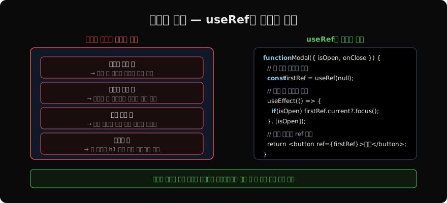
- 모달 열기 → 모달 내 첫 번째 포커스 가능 요소로 이동
- 모달 닫기 → 모달을 열었던 버튼으로 포커스 복원
- 폼 에러 → 첫 번째 에러 필드로 포커스 이동
- 라우팅 → 새 페이지의
h1또는 메인 콘텐츠로 이동 - 드롭다운 열기 → 첫 번째 옵션으로 포커스 이동
useRef로 포커스 제어
useRef로 DOM 요소에 직접 참조를 얻고 .focus()를 호출한다.
import { useRef, useEffect } from 'react';

function SearchPage() {
  const searchInputRef = useRef<HTMLInputElement>(null);

  // 페이지 마운트 시 검색창으로 포커스
  useEffect(() => {
    searchInputRef.current?.focus();
  }, []);

  return (
    <div>
      <h1>검색</h1>
      <input
        ref={searchInputRef}
        type="search"
        placeholder="검색어 입력"
      />
    </div>
  );
}
?.focus() optional chaining으로 null 체크를 간결하게 처리한다.
모달 포커스 이동 + 복원
function useModalFocus(isOpen: boolean) {
  const firstFocusRef = useRef<HTMLElement>(null);
  const triggerRef = useRef<HTMLElement | null>(null);

  useEffect(() => {
    if (isOpen) {
      // 모달 열기: 트리거 기억 → 모달 첫 요소 포커스
      triggerRef.current = document.activeElement as HTMLElement;
      // 비동기로 처리해야 Portal이 DOM에 마운트된 후 실행
      requestAnimationFrame(() => {
        firstFocusRef.current?.focus();
      });
    } else {
      // 모달 닫기: 트리거로 포커스 복원
      triggerRef.current?.focus();
    }
  }, [isOpen]);

  return firstFocusRef;
}
function Modal({ isOpen, onClose, children }: ModalProps) {
const firstFocusRef = useModalFocus(isOpen);
if (!isOpen) return null;
return createPortal(
<div role="dialog" aria-modal="true">
<button ref={firstFocusRef} onClick={onClose} aria-label="닫기">×</button>
{children}
</div>,
document.getElementById('modal-root')!,
);
}포커스 트랩(Focus Trap)
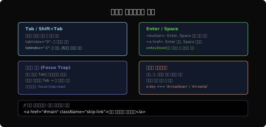
모달이 열려 있을 때 Tab 키로 모달 밖으로 나가면 안 된다. 포커스가 모달 안에서만 순환하도록 잡아두는 것을 포커스 트랩이라고 한다.
직접 구현
function useFocusTrap(containerRef: React.RefObject<HTMLElement>, isActive: boolean) {
  useEffect(() => {
    if (!isActive || !containerRef.current) return;

    const container = containerRef.current;
    const focusableSelectors = [
      'button:not([disabled])',
      'input:not([disabled])',
      'select:not([disabled])',
      'textarea:not([disabled])',
      'a[href]',
      '[tabindex]:not([tabindex="-1"])',
    ].join(', ');

    const handleKeyDown = (e: KeyboardEvent) => {
      if (e.key !== 'Tab') return;

      const focusable = Array.from(
        container.querySelectorAll<HTMLElement>(focusableSelectors),
      );
      const first = focusable[0];
      const last = focusable[focusable.length - 1];

      if (e.shiftKey && document.activeElement === first) {
        e.preventDefault();
        last?.focus();  // Shift+Tab at 첫 요소 → 마지막으로
      } else if (!e.shiftKey && document.activeElement === last) {
        e.preventDefault();
        first?.focus();  // Tab at 마지막 요소 → 첫 번째로
      }
    };

    container.addEventListener('keydown', handleKeyDown);
    return () => container.removeEventListener('keydown', handleKeyDown);
  }, [containerRef, isActive]);
}
라이브러리 사용 (권장)
직접 구현은 엣지 케이스가 많다. focus-trap-react 라이브러리를 권장한다.
npm install focus-trap-reactimport FocusTrap from 'focus-trap-react';
function Modal({ isOpen, onClose, children }: ModalProps) {
if (!isOpen) return null;
return createPortal(
<FocusTrap
focusTrapOptions={{
initialFocus: '#close-btn',
returnFocusOnDeactivate: true,
escapeDeactivates: true,
onDeactivate: onClose,
}}
>
<div role="dialog" aria-modal="true">
<button id="close-btn" onClick={onClose}>닫기</button>
{children}
</div>
</FocusTrap>,
document.getElementById('modal-root')!,
);
}
방향키 내비게이션
메뉴, 탭, 라디오 그룹 등 Composite 위젯에서는 방향키로 항목 간 이동을 지원해야 한다.
function MenuList({ items }: { items: MenuItem[] }) {
  const [focusedIndex, setFocusedIndex] = useState(0);
  const itemRefs = useRef<(HTMLButtonElement | null)[]>([]);

  const handleKeyDown = (e: React.KeyboardEvent, index: number) => {
    let newIndex = index;

    if (e.key === 'ArrowDown') {
      e.preventDefault();
      newIndex = (index + 1) % items.length;
    } else if (e.key === 'ArrowUp') {
      e.preventDefault();
      newIndex = (index - 1 + items.length) % items.length;
    } else if (e.key === 'Home') {
      e.preventDefault();
      newIndex = 0;
    } else if (e.key === 'End') {
      e.preventDefault();
      newIndex = items.length - 1;
    }

    setFocusedIndex(newIndex);
    itemRefs.current[newIndex]?.focus();
  };

  return (
    <ul role="menu">
      {items.map((item, index) => (
        <li key={item.id} role="none">
          <button
            ref={(el) => { itemRefs.current[index] = el; }}
            role="menuitem"
            tabIndex={index === focusedIndex ? 0 : -1}  // Roving tabindex
            onKeyDown={(e) => handleKeyDown(e, index)}
            onClick={item.onClick}
          >
            {item.label}
          </button>
        </li>
      ))}
    </ul>
  );
}
Roving tabindex 패턴: 현재 포커스 아이템만 tabIndex=0, 나머지는 tabIndex=-1로 설정해 Tab 키가 그룹을 건너뛰게 한다.
스킵 링크
화면 상단에 “메인 콘텐츠로 건너뛰기” 링크를 두면 키보드 사용자가 반복되는 내비게이션을 매번 탐색하지 않아도 된다.
// App.tsx
function App() {
  return (
    <>
      <a href="#main-content" className="skip-link">
        메인 콘텐츠로 건너뛰기
      </a>
      <header>...</header>
      <nav>...</nav>
      <main id="main-content" tabIndex={-1}>
        {/* 콘텐츠 */}
      </main>
    </>
  );
}
.skip-link {
position: absolute;
top: -40px;
left: 0;
background: #000;
color: #fff;
padding: 8px 16px;
z-index: 9999;
}
.skip-link:focus {
top: 0; /* 포커스 시 화면에 나타남 */
}포커스 표시(visible focus)
키보드 사용자에게 현재 포커스 위치가 보여야 한다.
/* 포커스 링을 제거하지 말 것 */
button:focus {
  /* outline: none; ← 절대 이렇게 하면 안 됨 */
  outline: 2px solid #7ec8e3;
  outline-offset: 2px;
}

/* 마우스 클릭 시에는 포커스 링 숨기고 키보드에만 표시 */
button:focus:not(:focus-visible) {
  outline: none;
}

button:focus-visible {
  outline: 2px solid #7ec8e3;
  outline-offset: 2px;
}
포커스 관리는 React 접근성의 마지막 퍼즐 조각이다. 시맨틱 HTML + ARIA 속성 + 올바른 포커스 흐름이 갖춰지면 키보드만으로 앱을 완전히 사용할 수 있게 된다. 다음 글에서는 React의 애니메이션과 Error Boundary로 이어진다.
지난 글: React 접근성(a11y) 기초 — 스크린 리더와 시맨틱
다음 글: React에서 애니메이션 구현하기
읽어주셔서 감사합니다. 😊
PALDYN / ARTICLE AI
글의 개념, 수식, 코드에 대해 물어보세요.
질문과 관련된 문단을 골라 답변의 문맥으로 사용합니다.생각 중 · 0초