

지식
React
Portal 심화 — 모달과 토스트 직접 구현
React Portal을 활용해 프로덕션 수준의 모달 컴포넌트(Esc 닫기, 오버레이 클릭, 포커스 이동)와 Context 기반 토스트 알림 시스템을 처음부터 구현하는 실전 가이드입니다.
지난 글에서 Portal의 동작 원리와 createPortal API를 배웠다. 이제 실제 프로덕션에 쓸 수 있는 모달 컴포넌트와 전역 토스트 시스템을 처음부터 구현해 보자.
프로덕션 수준 모달 구현
단순히 createPortal로 DOM에 붙이는 것만으로는 부족하다. 실제 사용에는 여러 가지 부가 기능이 필요하다.
기본 Modal 컴포넌트
import { createPortal } from 'react-dom';
import { useEffect, useRef } from 'react';

interface ModalProps {
  isOpen: boolean;
  onClose: () => void;
  children: React.ReactNode;
}

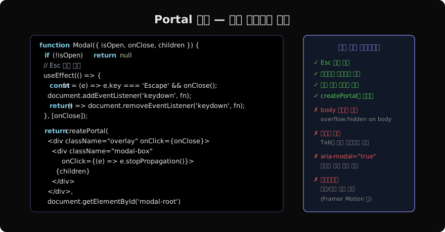
function Modal({ isOpen, onClose, children }: ModalProps) {
  const firstFocusRef = useRef<HTMLButtonElement>(null);
  const triggerRef = useRef<HTMLElement | null>(null);

  // 열릴 때: 포커스 이동 + 트리거 기억
  useEffect(() => {
    if (isOpen) {
      triggerRef.current = document.activeElement as HTMLElement;
      firstFocusRef.current?.focus();
      document.body.style.overflow = 'hidden';  // 스크롤 잠금
    } else {
      triggerRef.current?.focus();  // 닫힐 때 원래 포커스 복원
      document.body.style.overflow = '';
    }
  }, [isOpen]);

  // Esc 키로 닫기
  useEffect(() => {
    if (!isOpen) return;
    const handleKeyDown = (e: KeyboardEvent) => {
      if (e.key === 'Escape') onClose();
    };
    document.addEventListener('keydown', handleKeyDown);
    return () => document.removeEventListener('keydown', handleKeyDown);
  }, [isOpen, onClose]);

  if (!isOpen) return null;

  return createPortal(
    <div
      className="modal-overlay"
      onClick={onClose}
      role="presentation"
    >
      <div
        className="modal-box"
        role="dialog"
        aria-modal="true"
        onClick={(e) => e.stopPropagation()}  // 버블링 차단
      >
        <button
          ref={firstFocusRef}
          className="modal-close"
          onClick={onClose}
          aria-label="닫기"
        >
          ×
        </button>
        {children}
      </div>
    </div>,
    document.getElementById('modal-root')!,
  );
}
모달 사용 예시
function App() {
  const [isOpen, setIsOpen] = useState(false);

  return (
    <>
      <button onClick={() => setIsOpen(true)}>모달 열기</button>
      <Modal isOpen={isOpen} onClose={() => setIsOpen(false)}>
        <h2>확인</h2>
        <p>정말 삭제하시겠습니까?</p>
        <button onClick={() => setIsOpen(false)}>취소</button>
        <button onClick={handleConfirm}>확인</button>
      </Modal>
    </>
  );
}
CSS 설정
/* globals.css */
.modal-overlay {
  position: fixed;
  inset: 0;
  background: rgba(0, 0, 0, 0.6);
  display: flex;
  align-items: center;
  justify-content: center;
  z-index: 1000;
}

.modal-box {
  background: #1a1a2e;
  border-radius: 12px;
  padding: 32px;
  min-width: 400px;
  max-width: 90vw;
  position: relative;
}

.modal-close {
  position: absolute;
  top: 16px;
  right: 16px;
}
전역 토스트 시스템
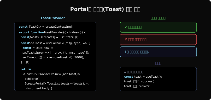
토스트 알림은 앱 어디서든 호출할 수 있어야 한다. Context + Portal 조합으로 구현한다.
// contexts/ToastContext.tsx
import { createContext, useContext, useCallback, useReducer } from 'react';
import { createPortal } from 'react-dom';

type ToastType = 'success' | 'error' | 'info' | 'warning';
interface Toast {
  id: number;
  message: string;
  type: ToastType;
}

type ToastAction =
  | { type: 'ADD'; payload: Toast }
  | { type: 'REMOVE'; payload: number };

function toastReducer(state: Toast[], action: ToastAction): Toast[] {
  switch (action.type) {
    case 'ADD':
      return [...state, action.payload];
    case 'REMOVE':
      return state.filter((t) => t.id !== action.payload);
    default:
      return state;
  }
}

const ToastContext = createContext<((message: string, type?: ToastType) => void) | null>(null);

export function ToastProvider({ children }: { children: React.ReactNode }) {
  const [toasts, dispatch] = useReducer(toastReducer, []);

  const addToast = useCallback((message: string, type: ToastType = 'info') => {
    const id = Date.now();
    dispatch({ type: 'ADD', payload: { id, message, type } });
    setTimeout(() => dispatch({ type: 'REMOVE', payload: id }), 3500);
  }, []);

  return (
    <ToastContext.Provider value={addToast}>
      {children}
      {createPortal(
        <div className="toast-container">
          {toasts.map((toast) => (
            <div key={toast.id} className={`toast toast-${toast.type}`}>
              {toast.message}
            </div>
          ))}
        </div>,
        document.body,
      )}
    </ToastContext.Provider>
  );
}

export function useToast() {
  const ctx = useContext(ToastContext);
  if (!ctx) throw new Error('ToastProvider 외부에서 사용 불가');
  return ctx;
}
토스트 사용
// 어느 컴포넌트에서든
function SaveButton() {
  const toast = useToast();

  const handleSave = async () => {
    try {
      await saveData();
      toast('저장되었습니다.', 'success');
    } catch {
      toast('저장에 실패했습니다.', 'error');
    }
  };

  return <button onClick={handleSave}>저장</button>;
}
.toast-container {
position: fixed;
bottom: 24px;
right: 24px;
display: flex;
flex-direction: column;
gap: 8px;
z-index: 9999;
}
.toast {
padding: 12px 20px;
border-radius: 8px;
color: white;
min-width: 280px;
}
.toast-success { background: #1a5c1a; border-left: 4px solid #55c555; }
.toast-error { background: #5c1a1a; border-left: 4px solid #e05555; }
.toast-info { background: #0d2233; border-left: 4px solid #7ec8e3; }Portal 심화 체크리스트
모달:
  ✓ 열릴 때 첫 번째 요소로 포커스 이동
  ✓ 닫힐 때 트리거 버튼으로 포커스 복원
  ✓ Esc 키 닫기 + 리스너 cleanup
  ✓ 오버레이 클릭 닫기 + stopPropagation
  ✓ body overflow: hidden (스크롤 잠금)
  ✓ role="dialog" + aria-modal="true"
  ✓ aria-label 또는 aria-labelledby

토스트:
  ✓ Context로 전역 접근
  ✓ 타입별 스타일 (success/error/info/warning)
  ✓ 자동 소멸 타이머
  ✓ 스택 가능 (여러 토스트 동시 표시)
  ✓ aria-live="polite"로 스크린 리더 알림
다음 글에서는 모달 구현에서 자연스럽게 등장한 접근성 속성들(role, aria-*)을 체계적으로 정리한다.
지난 글: React Portal — DOM 경계 너머에 렌더링하기
다음 글: React 접근성(a11y) 기초 — 스크린 리더와 시맨틱
읽어주셔서 감사합니다. 😊
PALDYN / ARTICLE AI
글의 개념, 수식, 코드에 대해 물어보세요.
질문과 관련된 문단을 골라 답변의 문맥으로 사용합니다.생각 중 · 0초